Custom tags in Markdown files
- Published • 3 min

Intro
The purpose of this blog post is to show you how you can use your own syntax in Markdown files. Benefits? More readable and maintenable content.
Directives are one of the four ways to extend markdown: an arbitrary extension syntax (see Extending markdown in micromark’s docs for the alternatives and more info). This mechanism works well when you control the content: who authors it, what tools handle it, and where it’s displayed.
:::pull-quote directive
If you look at the source of this document, you will find DIV container for pull quotes:
<div class="pull-quote">
  <blockquote
    cite="https://github.com/remarkjs/remark-directive#when-should-i-use-this"
  >
    <p>Directives are one of […]</p>
  </blockquote>
  <p class="pull-quote__meta"><cite>remark-directive documentation</cite></p>
</div>
However, I added the quote this way:
:::pull-quote{cite="https://github.com/remarkjs/remark-directive#when-should-i-use-this" source="remark-directive documentation"}
Directives are one of […]
:::
Enter custom directives! Here’s a plugin I wrote:
Config
// src/plugins/remarkPullQuote.ts

import type { ContainerDirective } from "mdast-util-directive";
import { visit } from "unist-util-visit";

export function remarkPullQuote() {
  return function (tree) {
    visit(tree, "containerDirective", function (node: ContainerDirective) {
      if (node.name !== "pull-quote") return;

      const cite = node.attributes?.cite;
      const author = node.attributes?.author;
      const source = node.attributes?.source;

      const blockquote = {
        type: "blockquote",
        children: node.children,
        data: {
          hProperties: cite ? { cite } : {},
        },
      };

      const metaHChildren = [];

      if (author) {
        metaHChildren.push({ type: "text", value: `–${author} ` });
      }

      if (source) {
        metaHChildren.push({
          type: "element",
          tagName: "cite",
          properties: {},
          children: [{ type: "text", value: source }],
        });
      }

      node.children = metaHChildren.length
        ? [
            blockquote,
            {
              type: "paragraph",
              children: [],
              data: {
                hName: "p",
                hProperties: { className: "pull-quote__meta" },
                hChildren: metaHChildren,
              },
            },
          ]
        : [blockquote];

      node.data = {
        ...node.data,
        hName: "div",
        hProperties: { className: "pull-quote" },
      };
    });
  };
}
:color-swatch directive
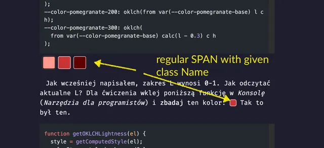
In the article Budowa palety kolorów przy pomocy OKLCH I am displaying colors in a form of color swatches. I’m just using <SPAN> in the source of the blog post.
Pięciostopniowa paleta została wyliczona przy pomocy Chroma (`C`), która ma zakres `0-5`. Kolor `#c93434` <span className="color-swatch" style="--data-color-swatch-color:#c93434" aria-hidden="true"></span>
został uplasowany w odpowiednim przedziale. Jako ciekawostkę dodam, że tło również generowane przy pomocy `OKLCH`. Mając na wejściu jeden kolor, na _UI_ uzyskujemy wiele.
I wanted to make it DRY. With :color-swatch directive I can just write:
:color-swatch{color="#c93434"}Which renders as . Same output, shorter syntax!
Config
import type { LeafDirective } from "mdast-util-directive";
import { visit } from "unist-util-visit";

export function remarkColorSwatch() {
  return function (tree) {
    visit(tree, "textDirective", function (node: LeafDirective) {
      if (node.name !== "color-swatch") return;

      const color = node.attributes?.color || "currentColor";
      const size = node.attributes?.size;

      const computedClass = [
        "color-swatch",
        size && `color-swatch--${size}`,
      ].join(" ");

      node.data = {
        ...node.data,
        hName: "span",
        hProperties: {
          className: computedClass,
          style: `--data-color-swatch-color: ${color}`,
          ariaHidden: "true",
        },
      };
    });
  };
}
textDirective, leafDirective, and containerDirective
:color-swatch has single colon (textDirective); :::pull-quote triple colons (containerDirective).
textDirective is used for inline content within a phrasing content (such as in paragraphs and headings). containerDirective can wrap nested block content like multiple paragraphs.
You can use playground on remark to check AST for Markdown (mdask). It may be useful when debugging why your plugin throws error and page does not compile.
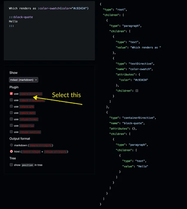
For input:
Which renders as :color-swatch{color="#c93434"}

:::block-quote
Hello
:::
You will get:
{
  "type": "root",
  "children": [
    {
      "type": "paragraph",
      "children": [
        {
          "type": "text",
          "value": "Which renders as "
        },
        {
          "type": "textDirective",
          "name": "color-swatch",
          "attributes": {
            "color": "#c93434"
          },
          "children": []
        }
      ]
    },
    {
      "type": "containerDirective",
      "name": "block-quote",
      "attributes": {},
      "children": [
        {
          "type": "paragraph",
          "children": [
            {
              "type": "text",
              "value": "Hello"
            }
          ]
        }
      ]
    }
  ]
}
Summary
Years ago my first experience with custom Markdown was GitHub Flavored Markdown but I at the time I wasn’t interested how I can build my own tags. Only recently I’ve found very rich ecosystem using remark and rehype. I admit: I do like it. Instead of repeating myself, I can use shorter syntax. It opens many possibilities for writing content.
I hope that you enjoyed the post.
Last but not least :)
Have fun!
If you give it a try
You will love it! By the way, this callout was build using rehype-callouts plugin.